How to Graph Y Mx B in Excel
To graph Y Mx B in Excel, enter the data, transform it into a graph, open the “Format Trendline” side pane, click “Display Equation on Chart,” and then save and share your graph. Graphing Y Mx B allows you to visualize linear relationships and trends in your data, making it easier to analyze and understand.
By following these steps in Excel, you can effectively plot Y Mx B equations and gain insights into the relationship between variables. Visual representations of mathematical equations offer valuable insights that can aid in decision-making and problem-solving across various fields.
Whether for academic, professional, or personal purposes, mastering the process of graphing Y Mx B in Excel is a useful skill that can enhance data analysis and visualization capabilities.
Credit: www.quora.com
Introduction To Graphing Y Mx B In Excel
Learn how to graph Y Mx B in Excel easily and effectively with our step-by-step guide. No need to struggle with complicated formulas or formatting options, we’ll walk you through the process and help you create professional-looking graphs in no time.
Why Graphing In Excel Is Useful
- Visual representation of data
- Easy to analyze trends
- Quick insights into relationships
Understanding The Equation Y = Mx + B
Linear equation format:
Credit: m.youtube.com
Steps To Graph Y Mx B In Excel
To graph Y Mx B in Excel, first input your data, then create a chart. Open the “Format Trendline” side pane and select “Display Equation on Chart” to show the equation. Save and share your graph for easy reference.
Enter The Data Into Excel
To graph Y Mx B in Excel, start by inputting your data into a new Excel spreadsheet. One column should represent the x-values, and another should capture the corresponding y-values.
Transform The Data Into A Graph
Next, highlight the data you’ve entered, go to the “Insert” tab, and select “Scatter” from the chart types. This will create a scatter plot of your data points.
Opening The ‘format Trendline’ Side Pane
With the scatter plot displayed, right-click on any data point in the plot and click “Add Trendline.” Then, check the “Display Equation on Chart” and “Display R-Squared Value on Chart” boxes as necessary.
Displaying The Equation On The Chart
Upon completing the previous step, you’ll observe the equation for the trendline automatically displayed on your scatter plot. Feel free to reposition and format it as you see fit.
Saving And Sharing The Graph
Once you’re satisfied with the graph, save your work and consider exporting the graph in a format suitable for sharing or incorporation into reports or other materials.
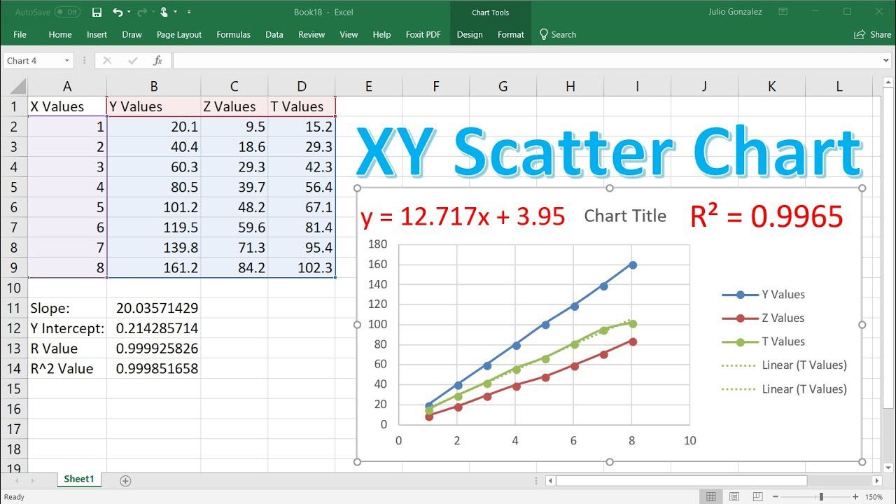
Adding Linear Trendline And Calculating Slope
When creating a graph in Excel, adding a linear trendline and calculating the slope can provide valuable insights into the data being visualized. Understanding these processes allows you to effectively analyze the relationship between variables and make informed decisions based on the trends identified. In this section, we will explore the steps for adding a linear trendline to the graph and then calculating the slope using Excel.
Adding A Linear Trendline To The Graph
To add a linear trendline to a graph in Excel, follow these simple steps:
- Select the data points on the graph.
- Right-click on the data points and choose “Add Trendline” from the context menu.
- In the “Format Trendline” pane, select “Linear” as the trend/regression type.
- Optionally, display the equation on the chart by checking the “Display Equation on chart” box.
Finding The Slope Using Excel
After adding the linear trendline, you can calculate the slope using Excel by following these steps:
- First, display the equation for the trendline on the chart to identify the slope (m) and y-intercept (b).
- Alternatively, use the SLOPE function in Excel to directly calculate the slope based on the given data points.
- Input the data range for the x and y values into the SLOPE function to obtain the slope.
Once you have obtained the slope value from the graph, it is essential to understand the meaning of the calculated slope and its implications for the relationships between the variables being analyzed.
The slope of the linear trendline represents the rate of change or the gradient of the relationship between the variables. A positive slope indicates a positive correlation, while a negative slope suggests a negative correlation. The magnitude of the slope denotes the steepness of the trend and the strength of the relationship between the variables. By interpreting the slope, you can gain valuable insights into the direction and intensity of the relationship depicted in the graph.
Graphing Y Mx B With Examples
Graphing a linear equation in Excel using the y=mx+b format can be a powerful tool for visualizing data relationships. In this blog post, we will explore how to graph y=mx+b with practical examples to enhance your understanding. Let’s delve into the detailed examples below:
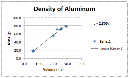
Example 1: Graphing A Simple Linear Equation
Let’s consider a basic linear equation y=2x+3. To graph this equation in Excel:
- Open Excel and input the x-values in column A and calculate the y-values using the formula =2A1+3 in column B.
- Select the data range, go to the Insert tab, choose Scatter Plot, and select the desired chart style.
- Your graph of the linear equation y=2x+3 is ready to visualize the relationship between x and y.
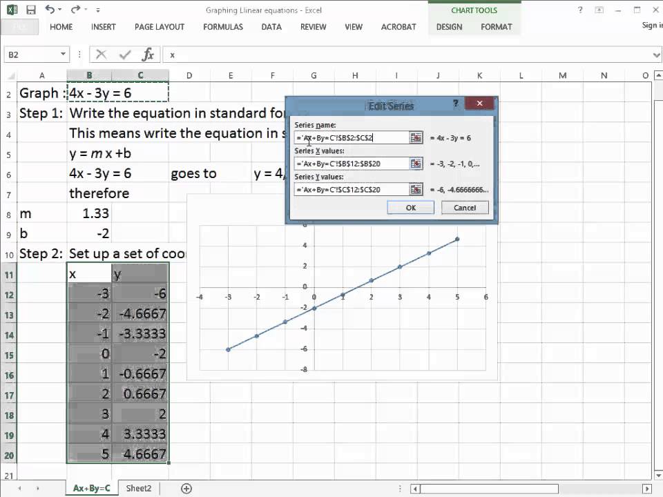
Example 2: Graphing Multiple Lines With Different Slopes
Let’s extend our learning by graphing multiple lines with different slopes. Consider equations y=2x+3 and y=3x+5. To graph in Excel:
- Input the x-values in column A, calculate y-values for both equations in columns B and C respectively.
- Select the data range, insert a Scatter Plot, and choose the desired chart style.
- Observe the graph displaying the two lines with distinct slopes of 2 and 3, helping in analyzing the data relationships visually.
Example 3: Customizing The Graph’s Appearance
Enhance your graph’s appearance by customizing various elements in Excel:
- Modify the color, style, and thickness of the lines to differentiate between multiple equations.
- Add data labels, legends, and titles to provide clarity on the data being presented.
- Adjust the axis scales, titles, and gridlines to improve readability and visualization.
By following these steps, you can create visually appealing graphs in Excel using the y=mx+b format to analyze linear relationships effectively.
Comparison With Other Graphing Tools
When it comes to graphing linear equations, Excel is often the go-to tool for many users. However, it’s also important to consider the alternatives and evaluate the pros and cons of using Excel for this purpose. In this section, we will discuss the advantages and disadvantages of using Excel for graphing linear equations, as well as explore alternative graphing tools.
Pros And Cons Of Using Excel For Graphing
Using Excel for graphing linear equations has its own set of advantages and disadvantages. Let’s take a look:
Pros:
- Easy and familiar interface: Excel is widely used and many people are already familiar with its interface, making it a user-friendly choice for graphing linear equations.
- Powerful data analysis capabilities: In addition to graphing, Excel offers various data analysis tools, allowing users to perform calculations and generate insights from their data.
- Flexible customization options: Excel provides a range of customization options for graphs, allowing users to tweak the appearance, labels, and axis scales according to their preferences.
Cons:
- Limited graphing capabilities: Although Excel is capable of graphing linear equations, it may not be as robust as specialized graphing tools when it comes to handling complex equations or visualizations.
- Steep learning curve for advanced features: While the basic graphing features in Excel are easy to use, mastering the more advanced functionalities may require a significant amount of time and effort.
- Restrictions on data size: Excel has limitations on the size of data that can be effectively graphed, and large datasets may cause performance issues or difficulties in creating accurate visual representations.
Alternative Graphing Tools For Linear Equations
If you’re looking for alternatives to Excel for graphing linear equations, consider the following tools:
| Tool | Description |
| GraphPad Prism | A comprehensive scientific graphing software that offers advanced features for data visualization and analysis. |
| Origin | A versatile software package known for its powerful graphing capabilities and extensive customization options. |
| Google Sheets | A free cloud-based spreadsheet tool that includes graphing features and allows for real-time collaboration. |
| R | A programming language and software environment for statistical analysis and data visualization, offering an extensive library of graphing functions. |
These alternatives provide varying degrees of functionality, flexibility, and ease of use. Depending on your specific requirements and preferences, one of these tools may be a better fit for your graphing needs.
Credit: www.chemistrygeek.com
Frequently Asked Questions Of How To Graph Y Mx B In Excel
How Do I Graph An Equation In Excel?
To graph an equation in Excel, enter data, transform it into a graph, open “Format Trendline” pane, click “Display Equation on Chart,” and save the graph.
How Do You Graph Slope And Y-intercept In Excel?
To graph slope and y-intercept in Excel, enter your data, create a scatter plot, add a trendline, choose “Display Equation on Chart. “
How Do You Plot X Y And Z In Excel?
To plot X, Y, and Z in Excel, input data, create a graph, add a trendline, display the equation on the chart, and save.
How Do You Graph A Function Using Y Mx B?
To graph a function using y=mx+b, follow these steps: 1. Enter the data into a table in Excel. 2. Transform the table into a graph. 3. Open the “Format Trendline” side pane. 4. Click on “Display Equation on Chart”. 5. Save and share the graph.
(Source: https://www. indeed. com/career-advice/career-development/how-to-graph-equation-in-excel)
Conclusion
Mastering the Y=mx+b graph in Excel opens up a world of data visualization possibilities. By understanding the process step by step, you can create accurate and visually appealing graphs. Implementing these skills can enhance your analytical capabilities and presentation effectiveness.