Linear Regression in Google Sheets allows users to perform linear regression analysis by creating a scatter plot, customizing the chart, and adding a line of best fit. Several tutorial videos are available on YouTube demonstrating how to perform linear regression in Google Sheets, including customizing charts, labeling lines, and exporting data.
This feature can also handle multiple linear regression by using multiple explanatory variables and a response variable. Additionally, users can calculate the linear R-squared value using the RSQ function in Google Sheets. Overall, Google Sheets provides a user-friendly and accessible platform for performing linear regression analysis, making it a valuable tool for data analysis and prediction.
Performing Linear Regression In Google Sheets
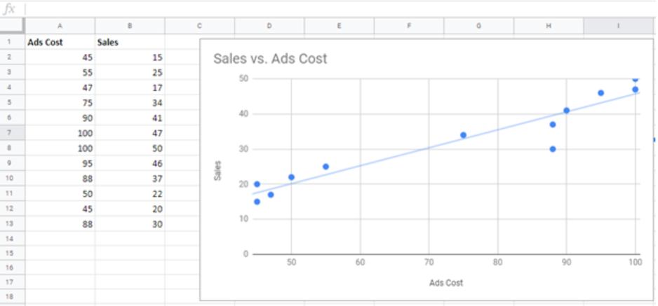
Creating A Scatter Plot
In Google Sheets, creating a scatter plot is a simple process. First, input your data into two separate columns. Then, highlight the data and navigate to the ‘Insert’ menu. From there, select ‘Chart’ and choose ‘Scatter’ as the chart type. Your scatter plot will be automatically generated, allowing you to visualize the relationship between your variables.
Adding A Trend Line
Once you have your scatter plot in Google Sheets, it’s easy to add a trend line. Simply click on the data points within the scatter plot to select them. Then, click on the ‘Chart Editor’ button and choose ‘Series.’ From there, you can select ‘Trendline’ and choose the type of trend line that best fits your data, such as linear, polynomial, or exponential.
Interpreting Regression Model
Interpreting the regression model in Google Sheets involves understanding the regression equation and its coefficients. The regression equation represents the relationship between the independent and dependent variables, while the coefficients provide insight into the strength and direction of that relationship. Google Sheets provides tools to easily visualize and interpret the regression model, making it accessible for users of all levels.
Credit: www.got-it.ai
Multiple Regression In Google Sheets
In linear regression analysis with Google Sheets, you can go beyond simple regression and incorporate multiple independent variables to gain deeper insights into the relationship between variables. This allows you to analyze the impact of multiple factors on an outcome and make more accurate predictions. In this section, we will explore how to use multiple variables in Google Sheets for regression analysis, as well as how to interpret the results.
Using Multiple Variables
When performing multiple regression in Google Sheets, you can include more than one independent variable in your analysis. This enables you to examine how each variable contributes to the variation in the dependent variable.
To use multiple variables in Google Sheets for linear regression, follow these steps:
- Select the data range that includes both the dependent variable and the independent variables.
- Go to the “Insert” menu and click on “Chart”.
- In the “Chart type” section, select “Scatter” chart.
- Click on “Customize” to modify the chart settings according to your preferences.
- Add a trendline to the scatter plot by clicking on the three-dot icon and selecting “Add trendline”.
- In the trendline options, choose the type of regression analysis you want to perform (linear, polynomial, etc.).
By using multiple variables in your regression analysis, you can gain a more comprehensive understanding of the relationships between variables and make more accurate predictions.
Interpreting Results
Once you have performed multiple regression analysis in Google Sheets, it’s essential to interpret the results correctly. Here are a few key points to consider when interpreting the results:
- Regression Coefficients: The coefficients associated with each independent variable represent the change in the dependent variable for each unit increase in the independent variable while holding other variables constant.
- R-Squared Value: The R-squared value measures the proportion of the total variation in the dependent variable that can be explained by the independent variables. A higher R-squared value indicates a better fit of the model.
- P-Values: P-values indicate the statistical significance of each independent variable. A low p-value (usually less than 0.05) suggests that the variable has a significant impact on the dependent variable.
By examining these statistics, you can gain insights into the relationships between variables and determine which independent variables have the most significant influence on the dependent variable.
Enhancing Linear Regression In Google Sheets
Linear Regression is a powerful tool in Google Sheets that allows you to analyze and predict trends in your data. However, there are several ways to enhance your linear regression analysis in Google Sheets, giving you more control and flexibility in your data interpretation. In this post, we will explore three key methods for enhancing linear regression in Google Sheets: customizing charts, utilizing regression equations, and exploring trend lines.
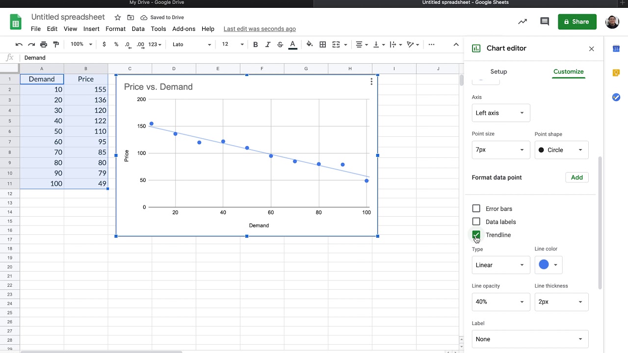
Customizing Charts
One way to enhance your linear regression analysis is by customizing the charts in Google Sheets. Customization allows you to tailor the visual representation of your data to best fit your needs. You can customize the chart type, colors, labels, and other chart elements to make it more visually appealing and easier to understand.
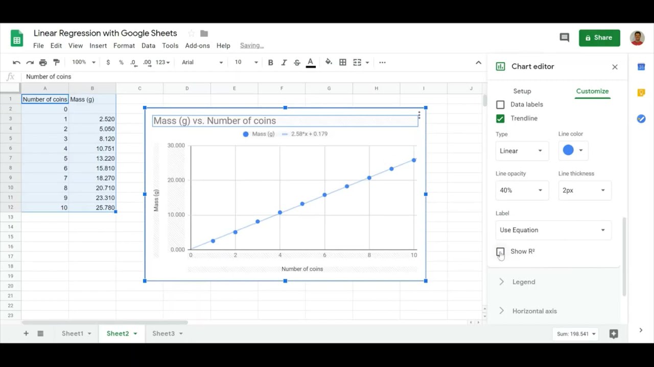
Utilizing Regression Equations
Another way to enhance your linear regression analysis is by utilizing regression equations in Google Sheets. Regression equations provide a mathematical model that represents the relationship between the independent variable(s) and the dependent variable. By using regression equations, you can calculate predicted values for the dependent variable based on given values of the independent variable(s).
Exploring Trend Lines
Trend lines are another valuable tool for enhancing your linear regression analysis in Google Sheets. Trend lines are a visual representation of the regression line and can help you understand the overall trend or pattern in your data. You can explore different types of trend lines, such as linear or polynomial trend lines, to gain further insights into your data.
By customizing charts, utilizing regression equations, and exploring trend lines, you can enhance your linear regression analysis in Google Sheets and gain deeper insights into your data. These methods provide you with more control and flexibility in interpreting and visualizing your data, leading to more accurate and meaningful results.
Credit: www.youtube.com
Resources And Tools For Linear Regression In Google Sheets
Resources and Tools for Linear Regression in Google SheetsAre you interested in harnessing the power of linear regression in Google Sheets? This blog post provides an overview of the valuable resources and tools available to help you master linear regression analysis in Google Sheets. From online calculators to detailed video tutorials and helpful add-ons, you’ll find everything you need to get started with linear regression analysis in Google Sheets.
Online Calculators
If you prefer to perform quick linear regression calculations without setting up formulas in Google Sheets, online calculators can be incredibly useful. These calculators allow you to input data and instantly receive regression analysis results, including regression line equations, correlation coefficients, and R-squared values. Check out these fantastic online tools:
Video Tutorials
Video tutorials provide an interactive way to learn linear regression in Google Sheets. These visual guides cover a wide range of topics, from creating scatter plots to interpreting regression equations, making it easier for learners to grasp complex concepts. Explore these popular video tutorials:
- How to Perform Linear Regression in Google Sheets – Statology
- Using Google Sheets for Linear Regression – Noel Pauller
- Linear Regression in Google Sheets – Dan Yasaki
- How to do regressions in Google Sheets – ColfaxMath
Helpful Add-ons
Enhance your linear regression capabilities in Google Sheets by utilizing helpful add-ons. These tools offer advanced features and functionalities, allowing you to perform sophisticated regression analysis with ease. Here are some valuable add-ons for linear regression:
Credit: m.youtube.com
Frequently Asked Questions Of Linear Regression Google Sheets
How Do I Do A Linear Regression In Google Sheets?
To perform linear regression in Google Sheets, create a scatter plot, add a trendline, and interpret the regression equation.
Can Google Sheets Do Multiple Regression?
Yes, Google Sheets can perform multiple regression using the LINEST function for more than one explanatory variable.
How Do You Find The Linear R Squared Value In Google Sheets?
To find the linear R-squared value in Google Sheets, use the RSQ function in a formula. Enter the formula with the dependent and independent variable data.
How Do You Write A Linear Equation In Google Sheets?
To write a linear equation in Google Sheets: 1. Select the data for x and y variables. 2. Click on “Insert” and choose “Chart” followed by “Scatter chart”. 3. Customize the chart as needed. 4. Add a trend line by selecting the chart, clicking on the three dots menu, and choosing “Add trendline”.
5. Select “Linear regression” from the drop-down menu. That’s it! Your linear equation will be displayed on the chart.
Conclusion
Mastering linear regression in Google Sheets can enhance your data analysis skills. By understanding how to perform linear regression, you can derive meaningful insights and make informed decisions based on your data. With the plethora of video tutorials and instructional resources available, mastering linear regression in Google Sheets is within reach for anyone looking to excel in data analysis.