To make a scatter plot in Google Sheets, create a data table and insert a scatter plot using the Explore feature or Insert Chart. Customize and style the chart for better visualization and analysis.
Scatter plots are essential for showcasing relationships between variables visually and are more effective than line charts for this purpose. When creating a scatter plot with multiple data sets, select the datasets, insert a scatter chart, customize settings, add a trendline, chart equation, and perform data analysis for meaningful insights.
Making scatter graphs in Google Sheets helps in understanding correlations and trends within the data for informed decision-making.
Credit: www.benlcollins.com
Getting Started With Scatter Plot In Google Sheets
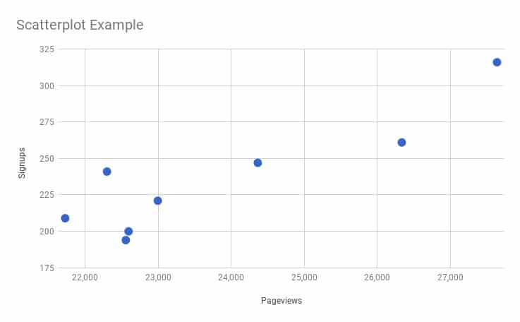
A scatter plot is a type of data visualization that uses points to represent individual data values. It is used to display the relationship between two numeric variables and helps in identifying trends, correlations, and outliers in the data. Each point on the scatter plot represents a combination of values for both variables. By plotting these points on a grid, patterns and relationships between the variables can be easily observed.
Benefits Of Using Scatter Plot
- Identify relationships: Scatter plots help in identifying relationships between variables, such as correlation and trends.
- Detect outliers: By visually analyzing the scatter plot, outliers or unusual data points can be easily identified.
- Communicate data effectively: Scatter plots provide a visual representation of data, making it easier to communicate findings and insights to others.
- Examine data distribution: Scatter plots help in understanding the distribution of data points and the concentration of values.
- Compare multiple datasets: Scatter plots can be used to compare multiple datasets by plotting multiple sets of points on the same plot.
Now that you understand what a scatter plot is and the benefits of using it, let’s dive into creating a scatter plot in Google Sheets.
Creating A Basic Scatter Plot In Google Sheets
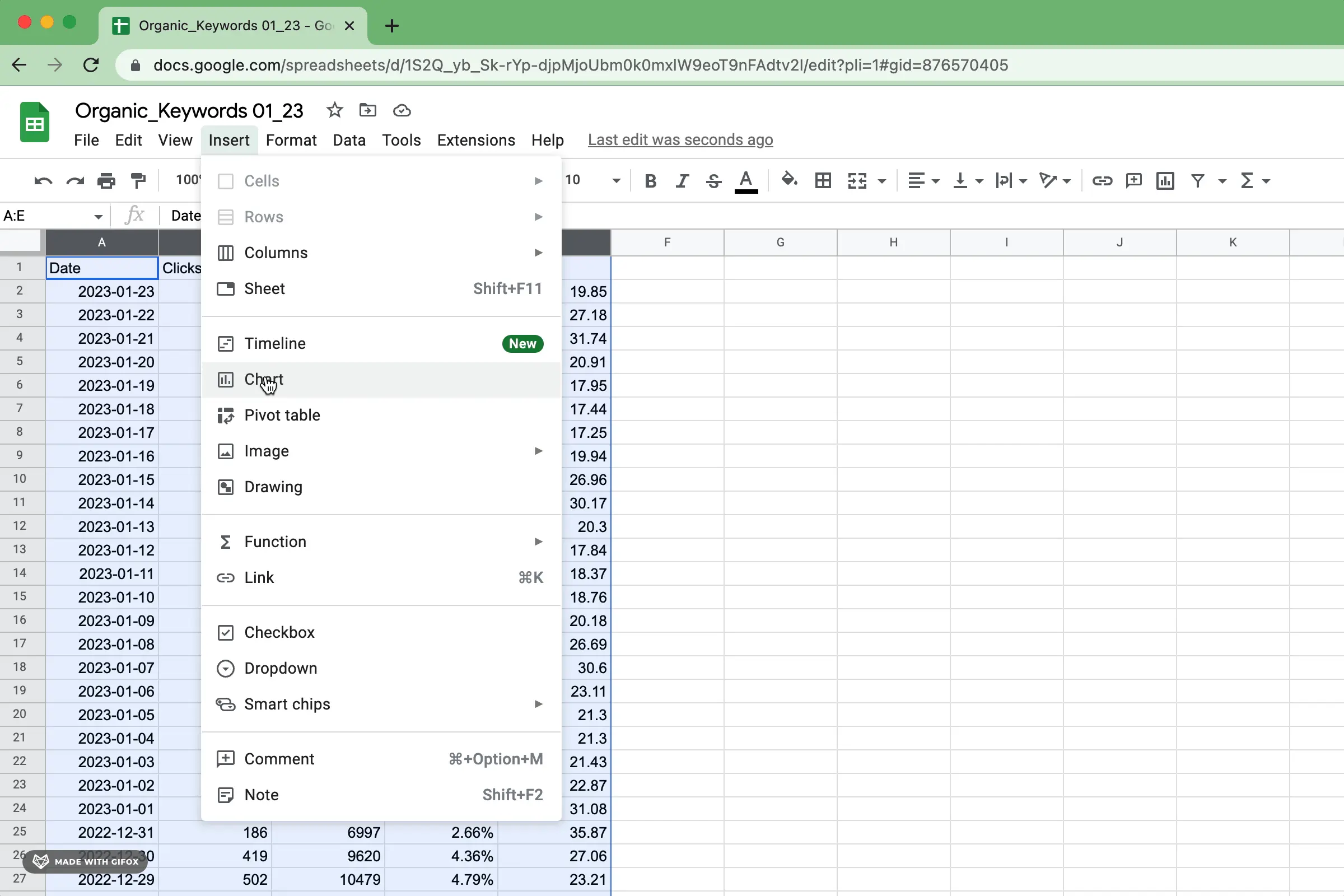
To make a basic scatter plot in Google Sheets, start by creating a data table, then insert a scatter plot using the Explore feature or Insert Chart. After that, customize and style the chart to your preference. You can also add a trend line and interpret the error bars for a more comprehensive analysis.
Setting Up Data Table
When starting to create a scatter plot in Google Sheets, the first step is to organize your data properly. Ensure the X and Y values are clearly defined in separate columns or rows.
Inserting A Scatter Plot
To insert a scatter plot in Google Sheets, navigate to the ‘Insert Chart’ option. Select the ‘Scatter’ chart type to create your scatter plot based on the data you’ve prepared.
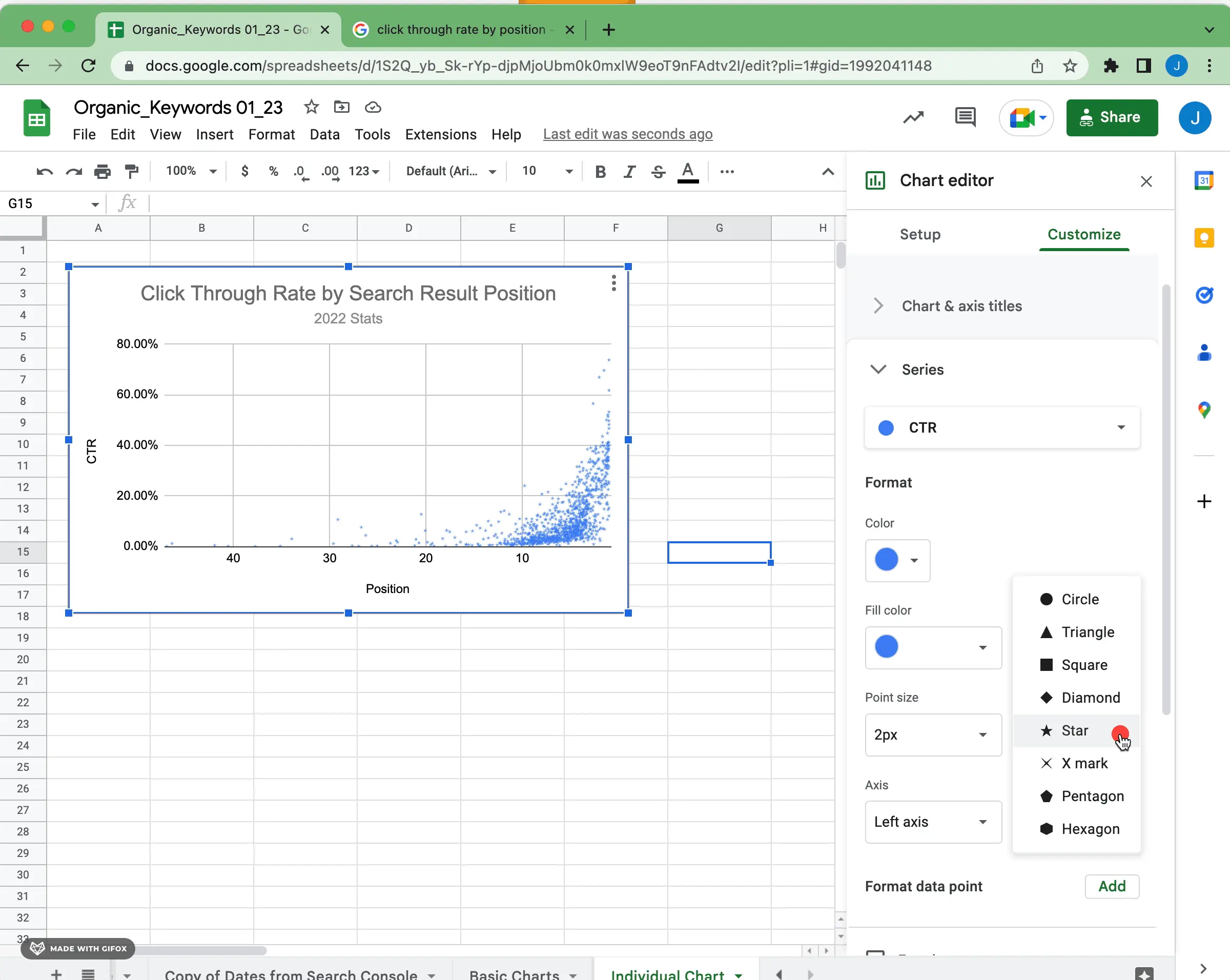
Customizing And Styling The Chart
After inserting the scatter plot, you can customize it to enhance its visual appeal and readability. Modify the chart title, axis labels, colors, and markers to suit your preferences.
- Customization Tip: Adjust the size of data points and add trendlines to visualize patterns in the scatter plot effectively.
- Styling Note: Use contrasting colors for data sets and provide a clear legend for easy interpretation.
Enhancing Scatter Plot With Additional Features
Enhance your scatter plot in Google Sheets by adding additional features such as trend lines, error bars, and clusters. Customize and style your chart to provide valuable context and analysis. With these simple steps, you can create a visually appealing and informative scatter plot for your data.
Adding A Trend Line
To add a trend line to your scatter plot in Google Sheets, follow these steps:
- Select your scatter plot chart.
- Click on the “Chart Editor” on the right side.
- Go to the “Series” option.
- Find the series you want, and under “Trendline,” select the type you prefer.
Including Error Bars
To include error bars in your scatter plot, do the following:
- Select your scatter plot chart.
- Click on the “Customise” tab in the Chart Editor.
- Under “Series,” select the series you want to add error bars to.
- Toggle the “Error Bars” option to turn them on.
Interpreting Error Bars
Understanding error bars in a scatter plot is crucial. Here’s how to interpret them:
- Error bars represent the variability or uncertainty in data points.
- Long error bars indicate higher variability, while short ones mean lower variability.
- Error bars can help compare data sets and assess statistical significance.
Credit: www.superchart.io
Advanced Techniques For Scatter Plots In Google Sheets
Scatter plots are a powerful tool in data visualization, allowing you to visually analyze the relationship between two variables. With Google Sheets, you can create scatter plots easily. In this section, we’ll explore some advanced techniques to enhance your scatter plots and gain deeper insights from your data.
Using Multiple Data Sets
One of the advanced techniques for scatter plots in Google Sheets is working with multiple data sets. If you have multiple sets of data that you want to compare, you can create a scatter plot with different data series.
To use multiple data sets in your scatter plot:
- Select all the data sets you want to include.
- Go to the “Insert” tab and click on “Chart.”
- In the “Chart Type” section, select “Scatter.”
- Customize the scatter chart settings to add context, such as labels, titles, and axis names.
By using multiple data sets in your scatter plot, you can uncover patterns, correlations, and differences between the data sets, allowing for a more comprehensive analysis.
Applying Trendline And Chart Equation
Another advanced technique for scatter plots in Google Sheets is applying a trendline and chart equation. A trendline is a line that best fits the data points in a scatter plot, helping you understand the overall trend and make predictions.
To apply a trendline and chart equation:
- Select your scatter plot.
- Right-click and choose “Add Trendline.”
- In the “Trendline” options, select the type of trendline you want to use, such as linear, exponential, or polynomial.
- Tick the box for “Display equation on the chart” to show the equation that represents the trendline.
By adding a trendline and chart equation, you can easily identify the direction and strength of the relationship between the variables in your scatter plot.
Exploring Data Analysis Methods
Lastly, you can explore various data analysis methods to gain additional insights from your scatter plot. Google Sheets provides several built-in data analysis tools that can help you understand the relationship between variables.
Some data analysis methods you can utilize include:
- Finding clusters: Use clustering analysis to identify groups or patterns in your data.
- Calculating statistical measures: Utilize statistical formulas to determine the central tendency, dispersion, and other statistical properties of your data set.
- Performing regression analysis: Analyze the relationship between variables and make predictions using regression models.
By employing these data analysis methods, you can uncover valuable insights and make informed decisions based on your scatter plot.
Optimizing Scatter Plot For Insightful Visualizations
When it comes to creating scatter plots in Google Sheets, optimizing the scatter plot for insightful visualizations can provide valuable insights into your data. Let’s explore how to tailor scatter plots to unlock their full potential.
Creating Scatter Plot Matrix
To create a scatter plot matrix in Google Sheets, use the following steps:
- Enter values for the X axis in the first column.
- Optionally, in the first row of each column, enter a category name to display as labels in the legend.
- Enter Y values in the other columns.
- Each row represents a point on the chart.
Utilizing Different Chart Types
Google Sheets offers various chart types, allowing you to utilize different chart options to enhance your scatter plot visualizations. Experiment with different chart types to find the most suitable representation of your data.
Tailoring Scatter Plot For Specific Insights
To tailor a scatter plot for specific insights, consider customizing the scatter chart settings to add context and provide a clearer understanding of the data. You can add trendlines, chart equations, and data analysis methods to enhance the insights derived from the scatter plot.
Credit: www.superchart.io
Frequently Asked Questions Of How To Make A Scatter Plot In Google Sheets
How To Make A Scatter Plot In Google Sheets With Two Sets Of Data?
To make a scatter plot in Google Sheets with two sets of data, select both datasets and insert a scatter chart. Customize chart settings, add a trendline, and incorporate data analysis tools for a comprehensive visualization.
How Do You Make An Xy Graph On Google Sheets?
To make an XY graph on Google Sheets, go to the Chart tab, select Scatter chart, and watch it create the XY graph or scatter plot immediately using your data.
How Do You Make A Scatter Plot Matrix In Google Sheets?
To make a scatter plot matrix in Google Sheets, follow these steps: 1. Enter X-axis values in the first column. 2. Optionally, enter a category name in the first row of each subsequent column. 3. Enter Y-axis values in the corresponding columns.
4. Each row represents a point on the chart. 5. Select the data range and click on “Insert” > “Chart” > “Scatter chart” to create the scatter plot matrix.
How Do I Plot A Graph In Google Sheets?
To plot a graph in Google Sheets, create a data table. Then, go to Insert and select “Chart. ” Choose the Scatter Plot option. Customize the chart and add a trend line if needed.
Conclusion
To summarize, creating a scatter plot in Google Sheets is a simple and effective way to visualize data relationships. By following the steps mentioned in the blog post, such as inserting a scatter plot, customizing and styling the chart, and adding trend lines or error bars, you can easily create an informative and visually appealing graph.
With its user-friendly interface and various customization options, Google Sheets proves to be a valuable tool for data analysis. So, go ahead and start making impressive scatter plots with ease!


