How to Know If Data is Normally Distributed in Excel
To determine if data is normally distributed in Excel, plot a histogram and observe a symmetrical bell-shaped curve. Additionally, conduct a normal probability plot and evaluate if the plotted points align closely to a straight line, indicating normal distribution.
Identifying normality in data is crucial for making accurate statistical inferences and selecting appropriate analytical techniques. Understanding the distribution of data allows researchers to effectively interpret results, choose suitable statistical tests, and validate assumptions. Whether analyzing financial trends, customer behavior, or medical data, recognizing normal distribution is fundamental for accurate decision-making and reliable conclusions.
We will explore the methods to ascertain if data is normally distributed in Excel, enabling you to confidently interpret and analyze your data.
Credit: www.automateexcel.com
Understanding Normal Distribution
To determine if data is normally distributed in Excel, you can create a boxplot by highlighting your data and going to Insert > Recommended Charts > All Charts > Box & Whisker. If the plot appears symmetrical, your data is likely normal.
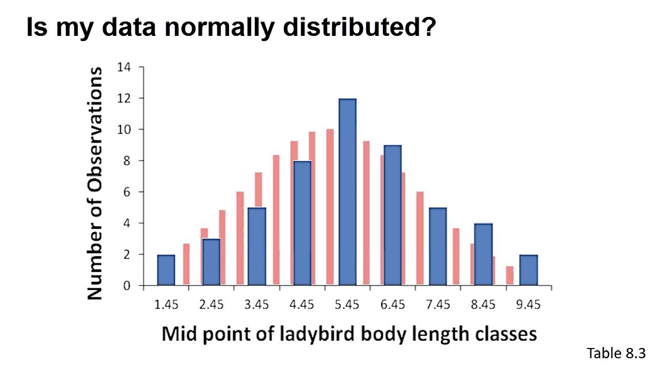
Another method is to plot a histogram and check if the bars roughly follow a bell-shaped curve.
What Is Normal Distribution?
Normal distribution, also known as Gaussian distribution, is a bell-shaped probability distribution that is symmetrical around the mean. In a normally distributed dataset, the mean, median, and mode are all equal.
Characteristics Of A Normally Distributed Data
- Bell-shaped curve: The data forms a symmetrical bell curve around the mean.
- 68-95-99.7 Rule: Approximately 68% of the data falls within one standard deviation of the mean, 95% within two standard deviations, and 99.7% within three standard deviations.
- Z-Score: Z-scores help determine how far a data point is from the mean in terms of standard deviations.
Why Is Normal Distribution Important?
- Statistical Analysis: Many statistical methods assume normal distribution, making it essential for accurate analysis.
- Modeling: In fields like finance and science, normal distribution is commonly used to model various phenomena.
- Quality Control: Normal distribution aids in quality control processes by identifying outliers and deviations from expected patterns.

Credit: www.inprolink.com
Checking Normality In Excel
When dealing with quantitative data, it’s essential to determine whether it adheres to a normal distribution. Excel provides various methods to check for normality, allowing you to make informed decisions based on your data. Below are some techniques to check for normality in Excel.
Using A Boxplot
A boxplot in Excel provides a quick visual assessment of the symmetry of your data. To create a boxplot, highlight your data and go to Insert > Recommended Charts > All Charts > Box & Whisker. If the plot appears symmetrical, it indicates that your data may be normally distributed.
Plotting A Histogram
Another way to assess normality in Excel is by plotting a histogram of your data. By examining the shape of the bars, you can approximate whether the distribution follows a symmetrical bell or hill shape, characteristic of a normal distribution.
Using Descriptive Statistics
Excel’s descriptive statistics provide valuable insights into the distribution of your data. By analyzing measures such as skewness and kurtosis, you can gain an understanding of the symmetry and peakedness of the distribution, aiding in the assessment of normality.
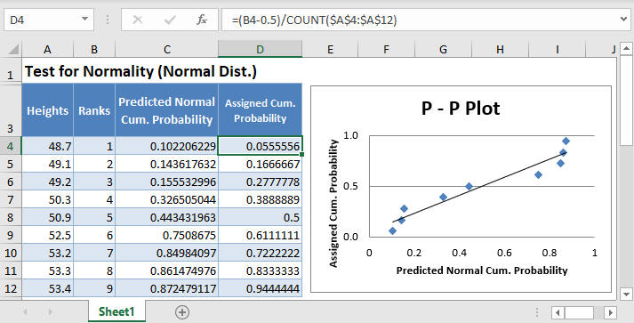
The Qq Plot
The QQ (Quantile-Quantile) plot is another method to assess the normality of your data in Excel. By comparing the quantiles of your data to those of a theoretical normal distribution, you can visually determine whether your data points align with the expected pattern of a normal distribution.
By employing these methods within Excel, you can effectively determine whether your data exhibits a normal distribution, providing a crucial foundation for statistical analysis and decision-making.
Statistical Normality Tests In Excel
Statistical normality tests in Excel provide valuable insights into the distribution of data. By running these tests, we can assess whether a given dataset adheres to a standard normal distribution, which is vital for many statistical analyses. Let’s delve into the various statistical normality tests available in Excel.
Shapiro-wilk Test
The Shapiro-Wilk test is a popular method for testing normality. It assesses the null hypothesis that a dataset is normally distributed. In Excel, this test can be performed using statistical functions or add-ins, providing p-values to determine the distribution’s normality.
Jarque-bera Test
The Jarque-Bera test is another normality test useful for large datasets. It examines the skewness and kurtosis of the data to infer normality. In Excel, the Jarque-Bera test can be computed using built-in functions or statistical software, facilitating a comprehensive assessment of distribution characteristics.
Kolmogorov-smirnov Test
The Kolmogorov-Smirnov test evaluates whether a dataset follows a specific distribution, such as the normal distribution. In Excel, this test can be conducted using custom macros or statistical analysis tools, allowing for thorough evaluation of distribution conformity.
Anderson-darling Test
The Anderson-Darling test is particularly suitable for assessing normality in large datasets. It examines the differences between the observed and expected cumulative distribution functions, providing insights into the dataset’s adherence to a standard normal distribution. In Excel, this test can be performed using specialized add-ins or custom functions.
Displaying Normal Distribution In Excel
How do you display the normal distribution in Excel? To do this, you will need to use the “Insert Function” feature in Excel. From there, you can select the “Normal Distribution” function, which will allow you to input the mean and standard deviation of your data. This will generate a bell curve based on your data.
Using The Insert Function Feature
Within Excel, navigate to the “Insert” tab and locate the “Function” option. Choose “Normal Distribution” to input the mean and standard deviation of your dataset. This function will create a bell curve representing the normal distribution.
Creating A Bell Curve
To create a bell curve in Excel, access the “Insert Function” feature and select “Normal Distribution.” Ensure to input accurate mean and standard deviation values to accurately represent the normal distribution of your data.
Identifying Skewness In Excel
To identify skewness in Excel and determine if data is normally distributed, you can calculate skewness using Excel functions. A skewed distribution will show unequal tail lengths in a histogram, indicating a deviation from normality. Check for symmetry in boxplots to assess normal distribution characteristics visually.
Calculating Skewness
To identify skewness in Excel, you’ll need to calculate the skewness value. Skewness measures the asymmetry of a distribution. A positive skewness indicates that the data is skewed to the right (tail on the right), while a negative skewness indicates a left skew (tail on the left).Interpreting Skewness Values
To interpret the skewness value, follow these guidelines: – A skewness value of 0 indicates a perfectly symmetrical distribution. – If the skewness is between -0.5 and 0.5, the distribution is considered approximately symmetrical. – A skewness value less than -0.5 indicates a left-skewed distribution. – A skewness value greater than 0.5 indicates a right-skewed distribution. To calculate the skewness in Excel, use the `SKEW` function. The formula for calculating skewness is `=SKEW(data_range)`. For example, let’s say you have a dataset in cells A1 to A10. To calculate the skewness, enter the formula `=SKEW(A1:A10)` in a new cell, and press Enter. The result displayed will be the skewness value. Once you have the skewness value, you can interpret it based on the guidelines mentioned above. This will help you determine if your data is normally distributed or skewed. Remember, it’s important to assess the skewness value in context with the specific dataset and the purpose of your analysis. The skewness value alone does not confirm or deny normality; it is just one of the indicators to consider. In conclusion, by calculating skewness in Excel and interpreting the resulting values, you can determine if your data is normally distributed or skewed.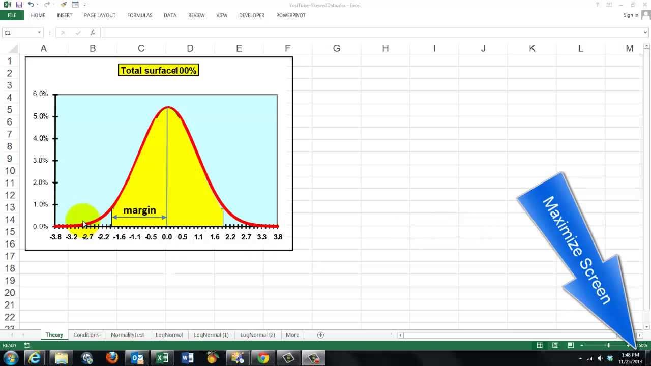
Credit: m.youtube.com
Frequently Asked Questions For How To Know If Data Is Normally Distributed In Excel
How Do You Tell If A Data Set Is Normally Distributed In Excel?
You can use a boxplot in Excel to check for normal distribution. Highlight the data, go to Insert > Recommended Charts > All Charts > Box & Whisker. If it looks symmetrical, the data might be normal. You can also plot a histogram and look for a bell-shaped curve.
How Do You Determine If Data Is Normally Distributed?
To determine if data is normally distributed, plot a histogram and observe the shape of the bars. If they form a symmetrical bell or hill shape, the distribution is likely normal. Alternatively, use statistical tests like the Shapiro-Wilk test or Chi-Square test in Excel to assess normality.
How Do You Display The Normal Distribution In Excel?
To display normal distribution in Excel, use the “Insert Function” feature. Select “Normal Distribution” function, input mean and standard deviation to generate a bell curve.
How Do You Know If Data Is Skewed In Excel?
To determine if data is skewed in Excel, you can plot a histogram and examine the shape of the bars. If the bars follow a symmetrical bell or hill shape, the data is likely normally distributed. Alternatively, you can create a boxplot by highlighting the data and going to Insert > Recommended Charts > All Charts > Box & Whisker.
If the plot appears symmetrical, the data is likely normal.
Conclusion
To determine if data is normally distributed in Excel, utilize box plots for visual symmetry. Check histograms for bell-shaped patterns indicating normal distribution. With these techniques, you can easily assess if your data follows a normal distribution pattern. Accurate data analysis is crucial for informed decision-making.