Control Chart Excel
To create a Control Chart in Excel, start by selecting a static data set and setting up control parameters. Add and format limit lines and alert data series in the chart.
Then establish a dynamic data range for real-time monitoring and analysis. Control Charts visually represent process changes over time, with central, upper, and lower control limits based on historical data. These charts aid in quality control and process improvement by identifying trends and variations efficiently.
By following a structured approach in Excel, businesses can effectively monitor and manage their processes to ensure optimal performance and quality standards, enhancing overall productivity and customer satisfaction.
Credit: www.qimacros.com
Basics Of Control Charts
To create a basic control chart in Excel, start by selecting a static dataset and set up the control parameter section. Then add and format the limit lines in the chart, followed by adding alert data series and formatting them.
Finally, set up a dynamic data range for better visualization and analysis.
Overview Of Control Chart
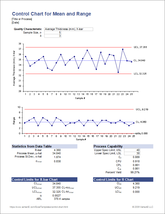
A control chart is a powerful tool used in statistical process control to help organizations monitor and measure process performance over time. It provides a visual representation of data collected from a process, allowing you to identify variations, trends, and potential issues. By plotting data points on a control chart, you can determine whether a process is stable or exhibits common or special cause variation. This information is essential for quality control, as it helps organizations identify and address sources of variation to ensure consistent and predictable outcomes.Components Of Control Chart
A control chart consists of three key components: the central line, upper control limit (UCL), and lower control limit (LCL).- Central Line: This line represents the average or mean of the process data. It serves as a reference point to gauge the performance of the process.
- Upper Control Limit (UCL): The UCL is a statistically calculated value that determines the upper boundary of acceptable variation. Any data points above this line indicate special causes of variation that require investigation and corrective action.
- Lower Control Limit (LCL): Similar to the UCL, the LCL is a statistically calculated value that represents the lower boundary of acceptable variation. Data points falling below this line also signal special causes of variation.
Credit: www.youtube.com
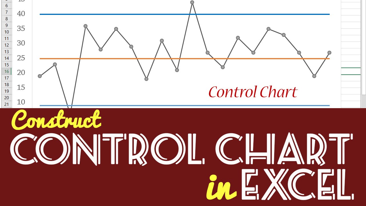
Creating A Control Chart In Excel
Control charts are valuable tools for monitoring and analyzing process variations in Excel. To ensure quality control and detect any abnormalities, creating a control chart with clear limit lines is essential. Let’s explore the steps to create a control chart in Excel:
Using A Static Data Set
- Select the static data set from your Excel spreadsheet.
- Organize the data in columns to represent the process observations.
- Ensure the data is consistent and error-free before proceeding.
Adding And Formatting Limit Lines
- Add upper and lower limit lines to the control chart.
- Format the limit lines for visibility and clarity.
- Choose distinct colors and styles for the limit lines.
Setting Up Dynamic Data Range
- Define a dynamic data range to allow for automatic updates.
- Utilize Excel functions or named ranges for dynamic data.
- Verify that the dynamic range captures all relevant data points.
Applications Of Control Charts In Excel
Applications of Control Charts in Excel are vast and essential for quality management. Control charts serve as a fundamental tool for monitoring processes, detecting variations, and ensuring consistency.
Stock Chart In Excel
A Stock Chart in Excel is a valuable tool for visualizing financial data, especially stock market trends. By selecting the data in the worksheet and using the INSERT function to create a Stock Chart, one can easily track Open-High-Low-Close data in a visually comprehensive format.
Control Sheet In Excel
Creating a Control Sheet in Excel involves inserting form controls through the Developer tab. By selecting a form control from the menu, placing it on the sheet, and modifying its settings through Format Control, users can easily design interactive control sheets for data management.
Uses Of Control Chart
- Monitor Process Changes Over Time
- Detect Variations in Data
- Ensure Consistency in Processes
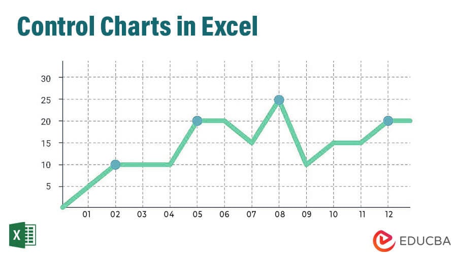
The Control Chart serves as a graph to analyze process changes, with lines for average, upper control limit, and lower control limit. These lines, derived from historical data, aid in maintaining quality standards and identifying deviations swiftly.
Credit: www.educba.com
Advanced Control Chart Techniques
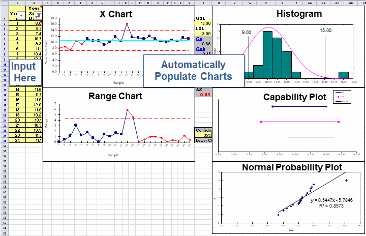
Learn Advanced Control Chart Techniques using Excel. Gain insights into creating dynamic control lines, calculating mean, selecting ranges, and more. Master the art of constructing Control Charts in Excel with step-by-step tutorials and downloadable templates.
In this section, we will explore advanced control chart techniques using Microsoft Excel. These techniques will enable you to create automated control charts and dynamically adjust chart ranges based on your data.
Creating Automated Control Chart
To create an automated control chart in Excel, you can utilize formulas and conditional formatting. By setting up your data with appropriate labels and formulas, Excel can automatically update the control chart as new data is added.
Here are the steps to create an automated control chart:
- Organize your data with labels for each column and calculate the necessary statistical measures such as mean, standard deviation, and control limits.
- Select the range of your data, including the labels.
- Go to the “Insert” tab and click on “Scatter” or “Line” chart.
- Choose the desired chart type, such as a scatter chart with smooth lines.
- Select the “Use column B as labels” option if your labels are in the first column.
- In the “Format Data Series” menu, select “Marker Options” to adjust the shape and size of the data points.
- Apply conditional formatting to highlight points that fall outside the control limits.
- As you add new data, the control chart will automatically update based on the defined range.
Dynamic Chart Range In Excel
Excel also allows you to create dynamic chart ranges, which automatically adjust as new data is added or removed from your dataset. This ensures that your control chart always includes the latest information.
Here’s how you can create a dynamic chart range in Excel:
- Organize your data in a table format with appropriate labels.
- Select the entire table range, including the labels.
- In the “Formulas” tab, click on “Define Name” to open the “New Name” dialog box.
- Enter a name for your dynamic range, such as “ChartData”.
- In the “Refers to” field, enter the formula “=OFFSET(Sheet1!$A$1,0,0,COUNTA(Sheet1!$A:$A),4)” where “Sheet1” is the name of your worksheet and “4” represents the number of columns in your table.
- Click “OK” to save the dynamic range.
- Create your control chart using the dynamic range “ChartData” as the data source.
- As you add or remove data from the table, the dynamic range will automatically adjust, and your control chart will update accordingly.
With these advanced control chart techniques in Excel, you can streamline your data analysis process and ensure that your control charts are always up to date.
Tips For Analyzing Data With Excel Control Chart
Tips for Analyzing Data with Excel Control Chart
Constructing An Excel Control Chart
When constructing an Excel control chart, it’s essential to identify the key components that contribute to its accuracy and reliability.
Improving Efficiency With Excel Control Chart
To improve efficiency with an Excel control chart, consider incorporating dynamic named labels for the UCL and LCL lines, as well as utilizing a dynamic data range for better adaptability and precision.
Frequently Asked Questions Of Control Chart Excel
How Do I Create A Control Chart In Excel?
To create a control chart in Excel, start with a static data set, set up control parameters, add limit lines, alert data series, and a dynamic data range.
How Do I Create A Stock Control Chart In Excel?
To create a stock control chart in Excel, select the data, go to INSERT > Stock Chart, then choose Open-High-Low-Close type.
How Do I Create A Control Sheet In Excel?
To create a control sheet in Excel: 1. Click the Developer tab. 2. Click Insert and select a form control. 3. Place the form control and right-click it. 4. Select Format Control and modify the settings. 5. Click OK to create the control sheet.
What Is The Control Chart Used For?
A control chart is used to analyze how a process changes over time by plotting data in time order. It includes a central line for the average, an upper line for the upper control limit, and a lower line for the lower control limit, all based on historical data.
Conclusion
To conclude, creating a control chart in Excel is a valuable tool for analyzing processes and identifying variations over time. By following the step-by-step process, you can effectively set up and format control limit lines, add alert data series, and create dynamic data ranges.
With the help of Excel, you can easily visualize and monitor the performance of your processes, allowing you to make informed decisions and improvements. Start utilizing control charts in Excel to gain valuable insights and enhance the quality of your outcomes.